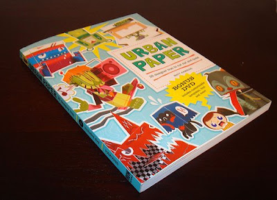
Shameless plug of the book I’m in: Urban Paper
Categories
Shameless plug of the book I’m in: Urban Paper
In a previous post a wrote about the Calling All Cars project from Jack Hankins aka Horrorwood.

I couldn’t help myself, and even with a broken wrist I designed a Calling All Cars-Custom:

I know that there are some other drivers in the race:
Matt Hawkins

Jerom

and of course Horrorwood himself…
But lets be realistic…. this isn’t going to be a fare race.
A bear, penguin and a monkey: they are just circus animals. And don’t get me started about the zombi.
And the tires are just so one dimensional….
If this is the best they can find for this race, we don’t even have to race and just give me my price.
whahahahahaha 🙂
Previous post I mentioned my broken wrist (another 5 weeks….) and the coming of the book �Urban Paper� from Matt Hawkins.
One of the designers started a project to promote the book. This is a project from Jack Hankins aka Horrorwood.
Calling All Cars! Calling All Cars.
Read more about this project. Or the comments at NPT.
Download the template and lets start racing:

Good news & bad news
First the good:
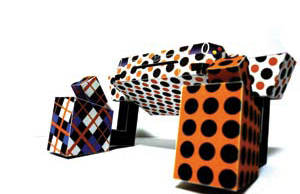
The book that I’m going to be in (book “Urban Paper” from Matt Hawkins) is printed: one of these days I will get my copy!!!!
I’ve written about it here and
here.
And this is the front:
And this the back:

You ca order it at Amazon: Urban-Paper-Designer-Toys.
And when you watch the video, wait till the last page:
it’s me with Son of a Grumm
then the bad:
I broke my wrist and can’t type very fast with one hand.
So I will be posting infrequently for about 5/8 weeks.
And the subjects will be short….
Methuup da Funky One, a member of NPT has created a custom in an way that I forgot about:
So here the example of Methuup:

Read more at NPT: Dizzzy Grumm Custom and Oppp-art Grumm Custom
Tips from Methuup himself:
Use Google and search for images with “Op-art” or “Optical-art”
I’ve done this also, but by printing the blank Grumm template on a comic or stationary paper.
The only sad thing is that there are no templates to download.
Since my post about NoissGrumm I’ve modified the legs and arms a little bit 🙂
This is a short explanation about this model:
I’m working for a company named NOISE (http://www.makesomenoise.nl) and I wanted to make a Grumm to “explain” what I’m doing in my spare time.
Now I worked on the legs, feet, arms and hands.
I’m not happy with the hand yet, but that will improve.


But the best stuff is yet to come: the template that are in the magazine can be downloaded form there:
part 1, part 2, part 3 and the blank template.
Read more about this contest at NPT
I’ve been asked to talk about this subject…… yeah this title is ohhh soooo original.
I though about it for a while (do I really want to make free advertising for a car company or a magazine?), but I couldn’t resist: Shin Tanaka is involved.
And that dude is cool!!
Shin is featured in an Asian/Amercan popculture magazine Giant Robot with a 3 piece robot: this image is the second one that can be found in Issue 57 of Giant Robot magazine.
Buy magazine 56, 57, 58 and you will have this:
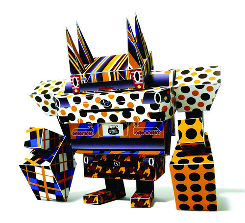
How cool is that!
The same thing about Scion, this brand isn’t sold in the Netherlands (perhaps it is, but I don’t know about it, and I have never seen one).
But if Scion is happy with this post, and want to reward me, just give me a xB (no, really!!)
I’m one step closer filling the 6 slots for Pusher Series 1 (Designers on Drukks).
Scott Schaller is filling the 5th slot with his Dr. Bear

An awesome design. And I love the extras Scott designed for Dr. Bear, especial the brain case.. Always wanted a evil Doctor in my papertoys collection.
Of course is Scott and Nice paper toys member, you almost have to be 😉 …
Some other nice-to�know information: Scott is a Graphic Design Teacher, which isn’t that special: a lot of papertoy designers have a creative job or education. No, besides teaching Graphic Design, Scott is also in charge of an after school program: F studio.
As a design teacher, I often throw in a lot of hand skills oriented components to the projects I assign. The computer plays a big part in all of our projects, but the finishing of a project, whether it is binding a box or constructing a packaging comp, is the part that makes the project complete. Paper toy crafting just seems to be a natural next step, combining design and illustration, hand skills, and toy making.
….
we are making our own vinyl toys, including the design, sculpting, and casting of resign models
How cool it that!!! I’m trying to figure this stuff out in my spare time and here is a teacher who can teach you everything you ever wanted to know. Man I’m jealous.
Visit Cabrillo Design Lab for more info.
Check this out: Custom self portraits by students of Scott (and himself) based upon boxy from Shin Tanaka.

Scott himself

Most of the time you can download papercraft stuff in .JPG or .PDF, and I just realized that I never have written about .PDF.
So here we go: I will only explain how to view a .PDF file, not how to create one. All pdf reader here are for free, if you need to pay for them is that because then you get the option to edit the pdf, and that is not what I want to cover here…
First of course we have to mention the mothership: Adobe Acrobat Reader.
![]()
I use this one when I need to be sure that complex patterns in some of my illustrations are visible without errors. It’s for Windows, Apple, Linux and many more. Downside is the extreme size: 33.5MB.

So I have two smaller pdf-reader who are very good, and I use it for almost anything because it’s faster and small footprint.
This is the one I use: Foxit Reader. You can use it on a memory stick, it’s made for Windows and Linux and I love it. In the past I had some “bugs” in prints that I made (didn’t show the pattern correctly) but that sort of bugs seems to disappear as this program gets worked on more and more. When I started using this program it was 1MB, now it’s 2.5MB and the bugs I had before are now disappeared.

The other one I want to mentions is Sumatra PDF. This is the one I use on my memory-stick. This pfd reader is the smallest to download: 1.2MB. It’s only a Window application and it’s a minimalistic design. Simplicity has a higher priority than a lot of features.

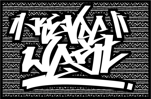
I wanted to write about this for a long time (about a year now). A list of good, free graffiti fonts.
But I’m not really into fonts, so it seems out-of-place on this blog.
Recently I needed a good free graffiti font, and saw that there was nobody who had made that list. Well that’s not entirely true, I found one: 12-fantastically-free-graffiti-fonts/ but I don’t agree with this list.
So instead of complaining about lists that other people make, I will start my own.
I used dafont to find the font used here, because every free font ends up there.
When I see designers using a graffiti font, they tend to use: Aaaiight!/Aaaight! fat, 5cent or Bring tha noize. Although they are nice, there are better graffiti fonts.
As every list is a personal reflection of the list-makers own taste and this list is made with stuff I like.
I like the condensed, tightly spaced, big marker tags and that’s what I like in the fonts. But I’m also a designer and it’s difficult to explain to your boss, that the font is “dope” but nobody can read the message. So I also looked at lower case, upper case, if it’s more a headline font or a body font, if it’s readable, the fonts has numbers, special characters, and that is use with a very scientific method to come to this list (my guts).
But I must say, I understand why nobody ever made this list… there are not a lot of good, complete fonts out there. Probably because good graffiti artists don’t go sit down and create a font for us, they are out there creating art! To everybody on this list (and not on this list), thanks for the free fonts and the time spend on making the font.
My list is cut up in two parts:
A “tag” is the most basic writing of an artist’s name in either spray paint or marker. A graffiti writer’s tag is his or her personalized signature.
source Wikipedia
Hardkaze by Pizzadude
http://www.dafont.com/hardkaze.font

[mck] This is the font that graphic designer should have chosen if he didn’t know better. It’s close to a normal handwriting and I get a “comic” vibe of it. It’s not graffiti enough, but better than the previous fonts.
Vandalism by Julien Saurin
http://www.dafont.com/vandalism.font

[mck] Really awesome font, but this one is probably not readable for “normal” viewer. But it’s freaking awesome!.
Searfont by bartolD & Sear
http://www.dafont.com/searfont.font

[mck] Really awesome font, but this one is probably not readable for “normal” viewer. But it’s freaking awesome!.
Whoa! by Johan Waldenstr�m
http://www.dafont.com/whoa.font

[mck] Wow!
Tagster by SDFonts
http://www.dafont.com/tagster.font

[mck] Could easily have been number 2, but it’s not complete.
Illegal Edding by Maurice van de Stouwe
http://www.dafont.com/illegal-edding.font

[mck] And from now a graphic designer should use this font. Love this one! And it has a complete font set
Philly Sans by Kosal Sen
http://www.dafont.com/philly-sans.font

[mck] Very clean, readable, and still it has a graffiti vibe. It shouldn’t have been number 1 because it has a very limited character set, but I love this font.
A “piece” is a more elaborate representation of the artist’s name, incorporating more stylized “block” or “bubble” letters, using three or more colors. This of course is done at the expense of timeliness and increases the likelihood of the artist getting caught.
…..
These pieces are often harder to read by non-graffiti artists as the letters merge into one another in an often undecipherable manner.
source wikipedia
If you need to make a piece in a design, you can also use the tag fonts, but never the other way around!
Throw-up Font by Graffilia Fet�n
http://www.dafont.com/throw-up-font.font

[mck] This list wouldn’t be complete if we didn’t have a throw-up font. I’m having trouble reading it.:(
Cancontrol by Johan Waldenstr�m
http://www.dafont.com/dht.font

[mck] Nice one
Aerosol by Bright Ideas
http://www.dafont.com/aerosol.font

[mck] This font is made to color in. Not my style, but very nice!
Homeboy by Johan Waldenstr�m
http://www.dafont.com/homeboy.font

[mck] Nice one
Zit Graffiti by Olivier “Zitoune” D.
http://www.dafont.com/zit-graffiti.font

[mck] A oldskool graffiti font. Nice
B-Boy by Johan Waldenstr�m
http://www.dafont.com/bboy.font

[mck] A very oldskool graffiti font, I like this one very much.
At Over 30 free high quality graffiti fonts I found one that is worth looking into: “KZ Gravity”
I found my font at dafont.com, but there are some nice font to be found at deviantart.com which I need to do (some time :P)
This one tricked me into it:

Sadly the font is copy of the image you see here, and the sizes are to radical. would be awesome I think